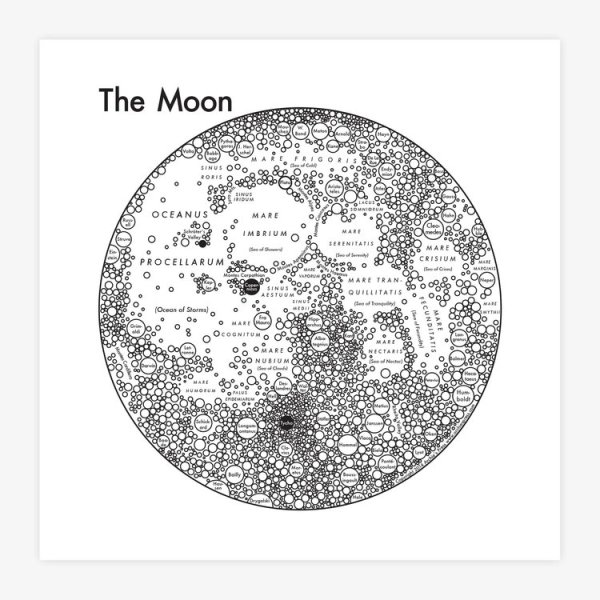
Archie’s Press publishes minimalist “mental” maps that are built from circles. “The circle, our Universe’s softest shape, clearly conveys size and connections.” – Archie says. He created a “Map from the Mind” for dozens of cities, simplifying structures and districts in the simplest terms. The same way Harry Beck’s London Tube Map simplified the representation of the real world to lines and curves, Archie Archambault expands this idea to cities, states, – and celestial bodies. He finds the best known features and names and shows them in a way easy to keep in your mind. This is cartography at its best.
His outer space series, also made along the same geometric principles, includes the maps of Jupiter, Mars, the Moon, Saturn, the Sun, The Solar System and the Galaxy. There is no unnecessry element on the maps: even annotations serve a cartographic purpose.
Q * How did you get the idea of expanding the Earth map to planets?
A * The Solar System map I devised is probably the most intuitive path. The bodies are spheres and they move in a rotation. Somehow, our brain understands both of these things as circles. I simply took the idea that made the most sense to my mine, and included as much information as made sense. I stopped when things got too crazy.
Q * What were the greatest challenges in creating the planetary maps?
A * If you notice, all four maps are drawn from a different angle, each specific to the most intriguing aspects of their makeup. Deciding which angle to take was really difficult for Mars, because there isn’t really a defining feature of the planet. We don’t really have any associations with either side (unlike the Moon, which always faces us in the same direction). We don’t have any general associations with the surface (unlike Jupiter which has a series of atmospheric layers). We don’t really care about what’s around it (Unlike Saturn, which has beautiful rings and moons). The only thing we all know is that it’s red. But what else makes Mars special? That’s always the hard.
Thinking about outer space requires a lot of imagination. There really isn’t a way to connect the maps of the planets with an actual understanding of the scale. I’m always trying to make the planets more and more relatable to our specific understanding of physical space.
Q * Craters are great features that fit into the circle design but how would you approach depicting bodies like Europa (full of linear cracks) – i.e., is this minimalist design applicable to any surface pattern?
A * Creating textures is a really tricky thing to do, and I love it when a texture is appropriate. Cracks are really hard to make look convincing while staying cartographic, so it would be a really big challenge to make it work. Of course it’s possible, but it’s a matter of taste to decide on a nice texture.
Q * How much did you follow actual crater distribution or topography?
A * The craters on the Moon map serve two purposes: to show that the Moon is covered in endless craters, and to show the sphericality of the Moon. I chose a few choice names of craters, some that were big, some that were interesting. My favorites are Darwin and Hell. Tycho is so bright, I made it solid silver.


